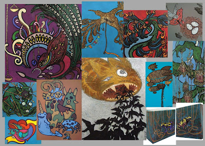
So, having to pick five pieces of my work as an example for a comp recently entered, it got me thinking about some of different styles I have worked with over the years.
One of my friends was lovely enough to do up a powerpoint for me, alas, I can't just load it up here! I've re-made them into grouped photos, so at a glance, if you didn't have time to scroll all the way down my blog, you can see what the content is.
(Notes as written by Ana!).
And its got me brewing up some new ideas for a series of new work using skate decks as support - stay tuned!
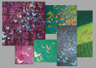 Group 1 : These designs are perfectly suited for the shape of a skate deck and the design itself is simple and dramatic and could easily be transposed to a ‘series’ across several skateboards where each piece would be different but always identified as coming from the same series.
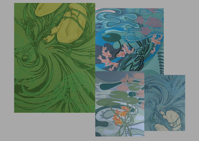
Group 2 : This grouping would look beautiful on a skateboard - they are simple and reflect the print method that seems to be favoured by royalefam. In particular - Anemone would look beautiful on the bottom of a deck.
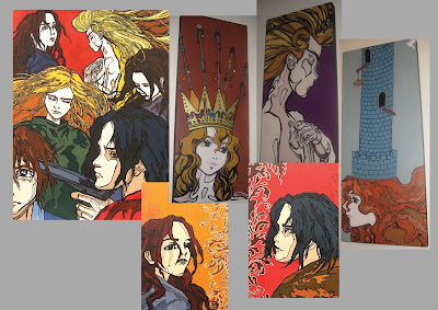 Group 3 : Anime is a powerful reminder of Western influencing everything Asian and how Asian is now influencing everything Western.
 Clare and the crown would look kick arse on a board but the Collective piece could showcase a style that would look awesome on a board - ie some dark superhero types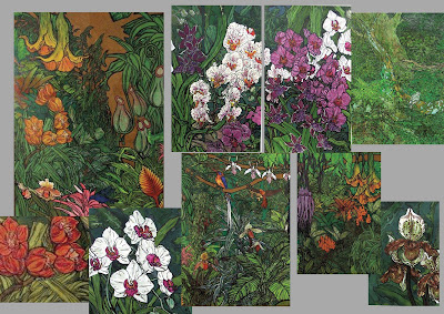 Group 4 : If I had a skateboard I would want this sort of illustration on them - A really feminine design on a skateboard is kick arse and makes it different to all others - however, the majority of skaters who fuel the market are notoriously young, male and bogan. I reckon this would strike a chord though for female skaters/ art enthusiasts.
 Group 4 : If I had a skateboard I would want this sort of illustration on them - A really feminine design on a skateboard is kick arse and makes it different to all others - however, the majority of skaters who fuel the market are notoriously young, male and bogan. I reckon this would strike a chord though for female skaters/ art enthusiasts.
 Group 5 (Below) : These designs would transcribe beautifully onto a skateboard and really appeal to the demographic. Personal favourites here are the Blimp Cats and Fearsome Friends - I think the Fearsome Friends is at that real high end of street art - where the characters could become a really well known graffiti/sticker series. - but the frogs are striking and helps represent the ‘breadth’ of my work.
